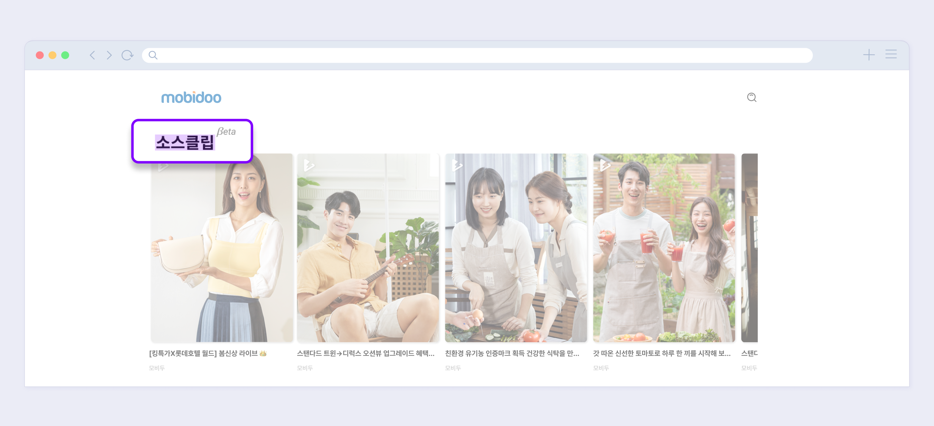
Sauceclip Customize
The Sauceclip player allows you to create your own content with a variety of custom settings.
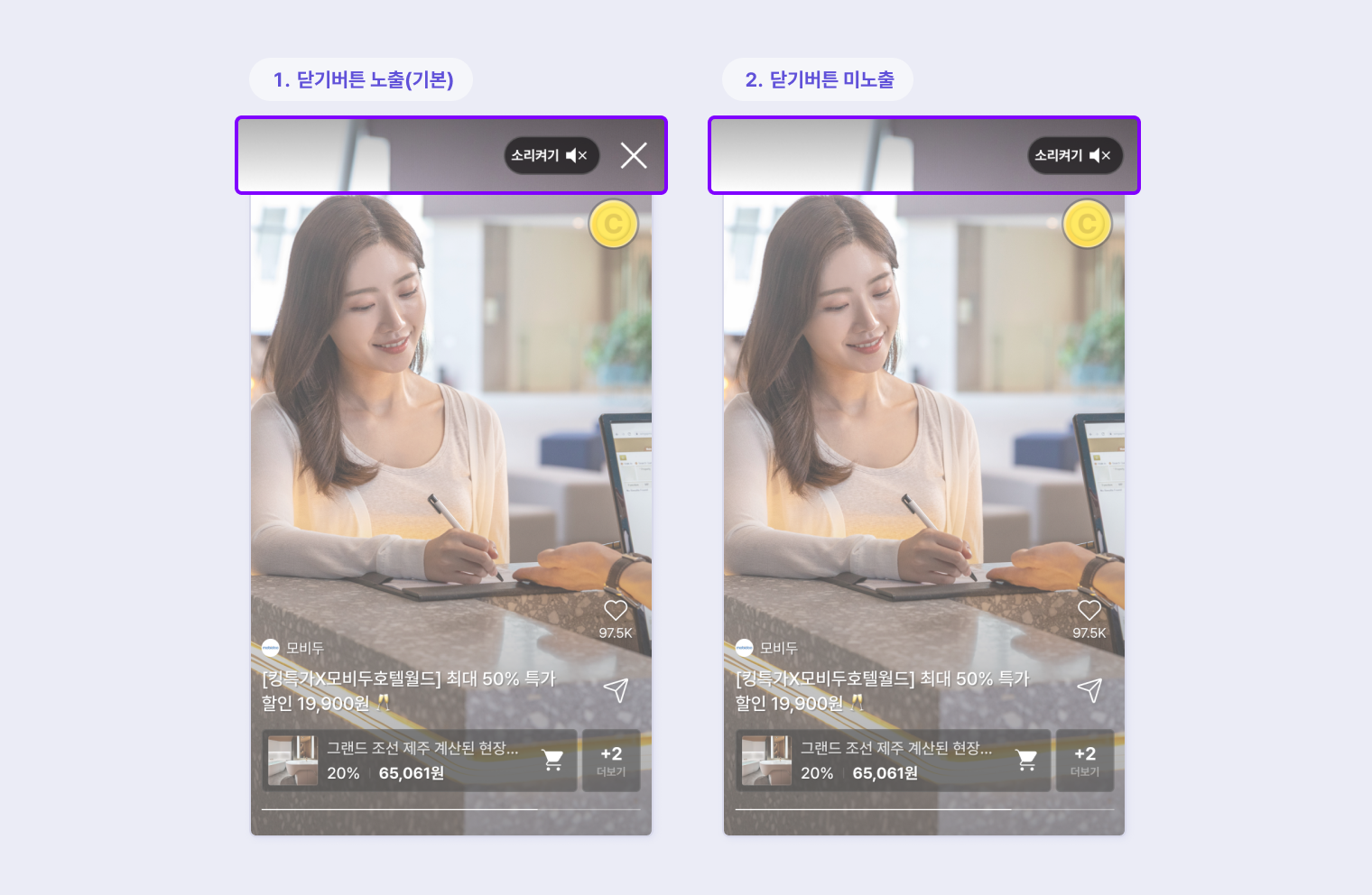
Close button
The close button [**x**] at the top of the player can be hidden.
- Default: Show the close button [x].
- Custom: Do not show the close button [**x**].
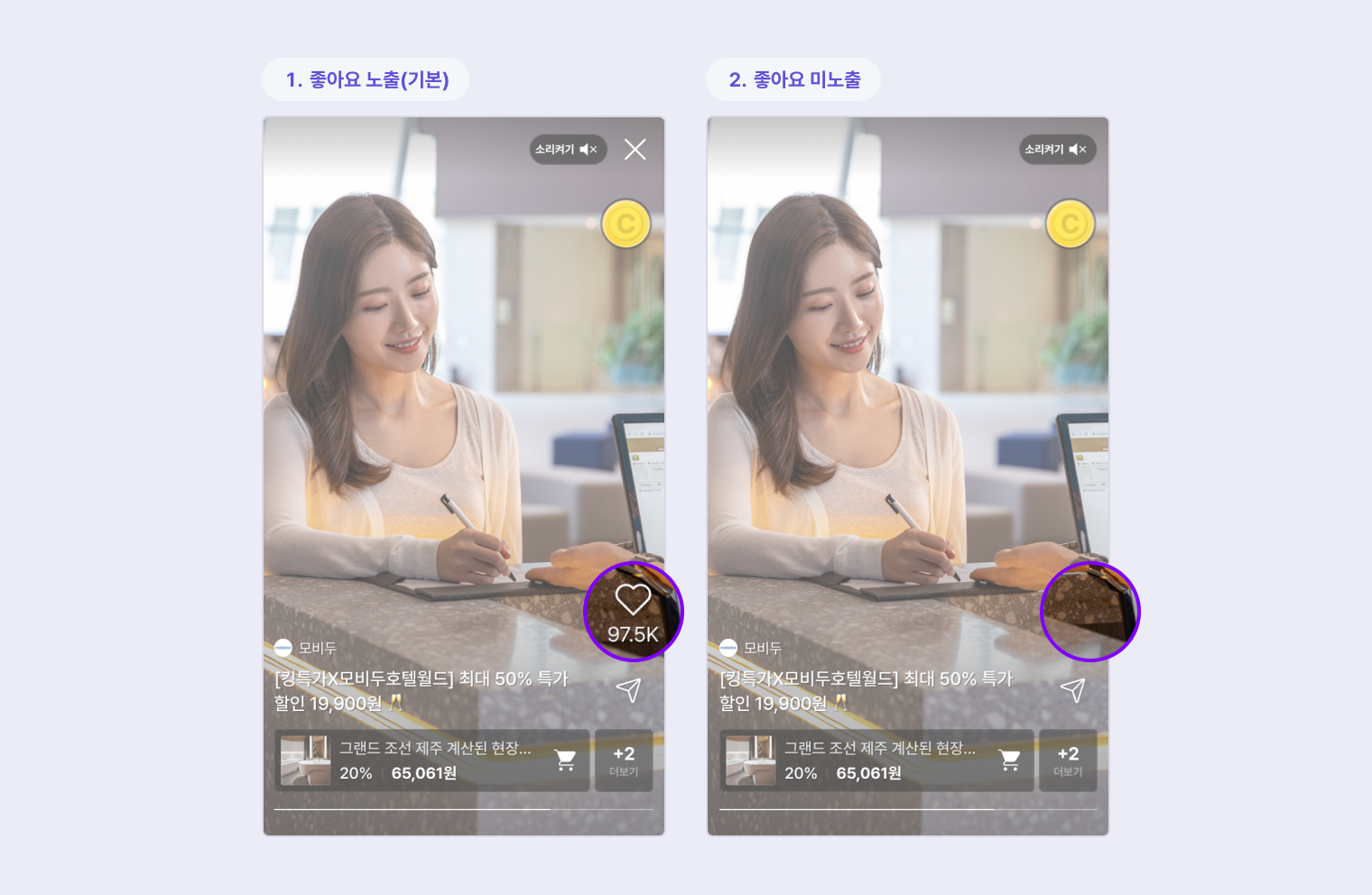
Like icon
You can set whether the like icon is visible in the player.
- Default: The Like icon is visible in the player and viewers can click it.
- Custom: Don't show the like icon in the player.
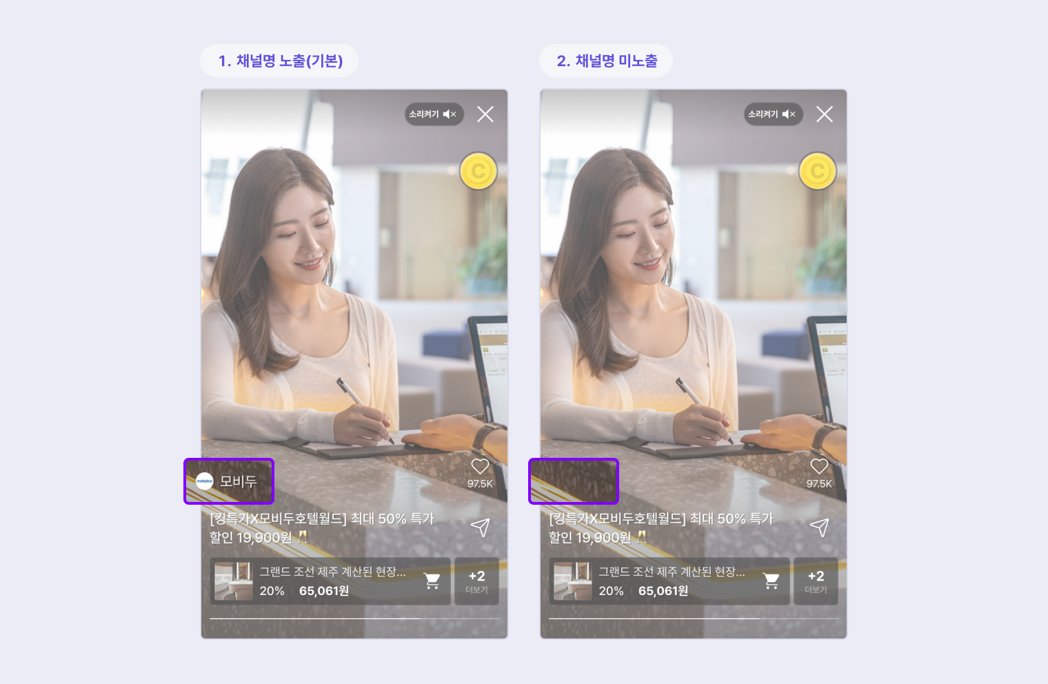
Channel name
You can set whether to show the channel name at the bottom of the player.
- Default: Show the channel name.
- Custom: Do not show the channel name.
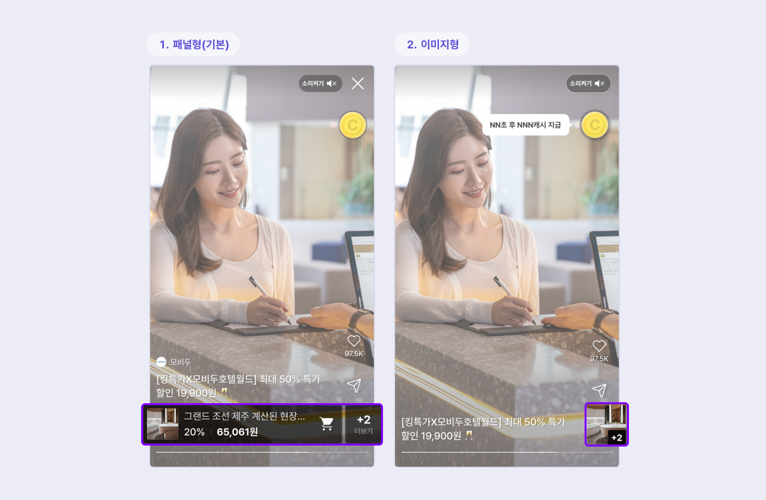
Products preview
You can choose how you want to display your products.
- Default : The default setting is Panel, which displays the product name and image at the bottom of the player.
- Custom: The product is displayed as an image in the icon area instead of at the bottom of the player.
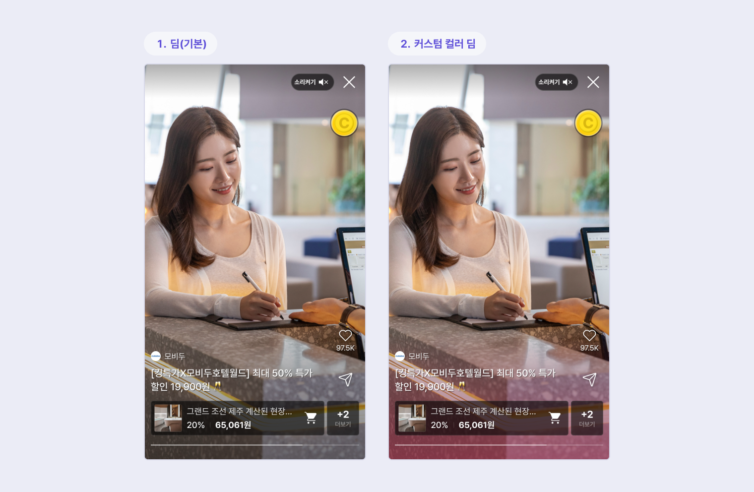
Product area color
You can apply your brand colors to the player in the form of a dim.
- Default : No color is exposed in the product area.
- Custom : The product area can be dimmed with your branded color.
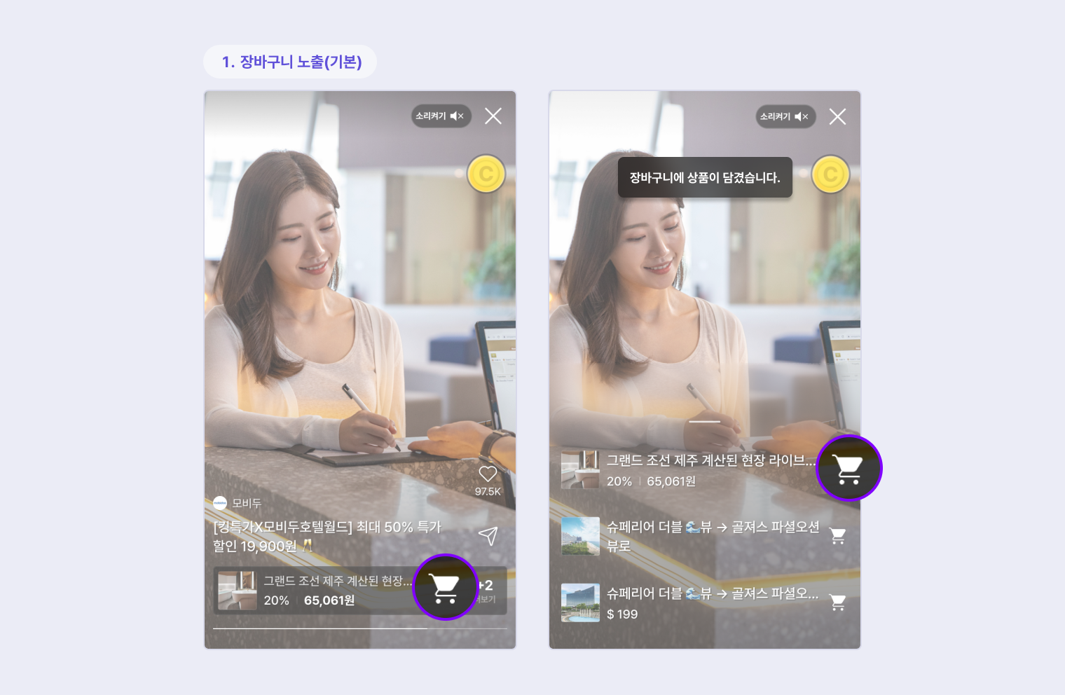
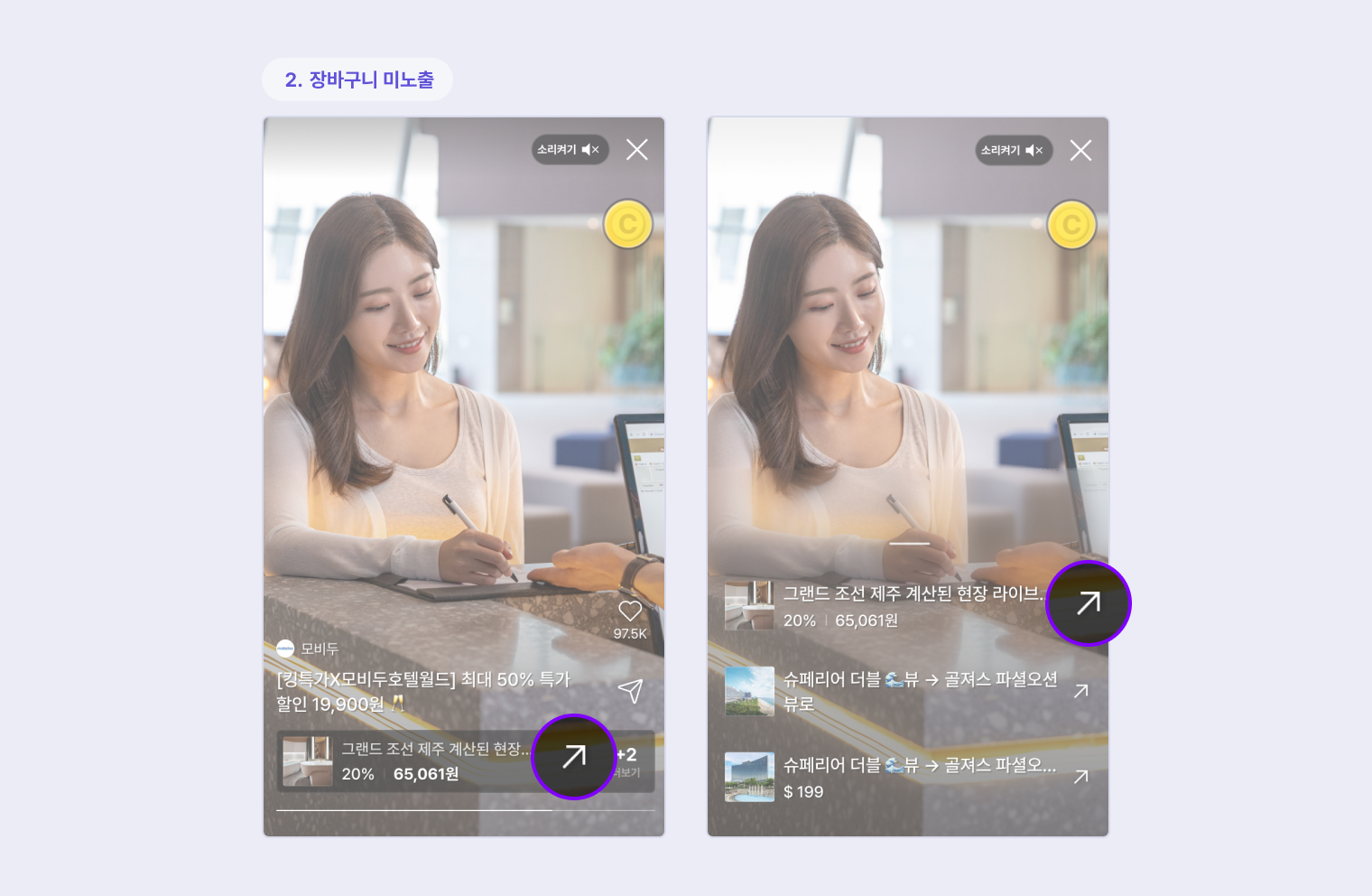
Cart
You can set up the shopping cart feature to allow viewers to add items to their cart while watching Sauceclip videos without leaving the screen.
- Default : Show the shopping cart in the player's product area, and you can add products to the cart without leaving the screen. Items in the cart are identified by a cart icon.
- Custom : Do not show the shopping cart in the player's product area, and click on a product to go to the purchase or more information page.
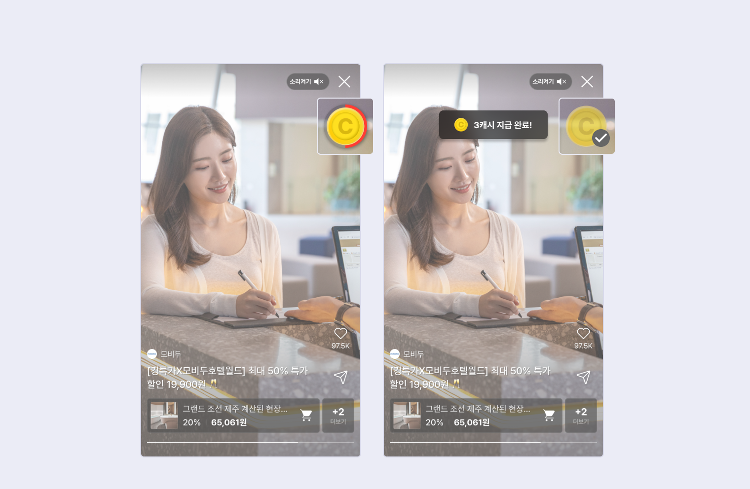
Reward Image
You can change the reward progression and reward achievement images used by Sauceclip to images of your choice.
- Default : Use the reward progression and reward achievement images provided by Mobidoo. The reward achievement image provided by Mobidoo is marked with a check (✔️) in the default image.
- Custom: You can provide your own reward progression and reward achievement images and we will apply them to the player.
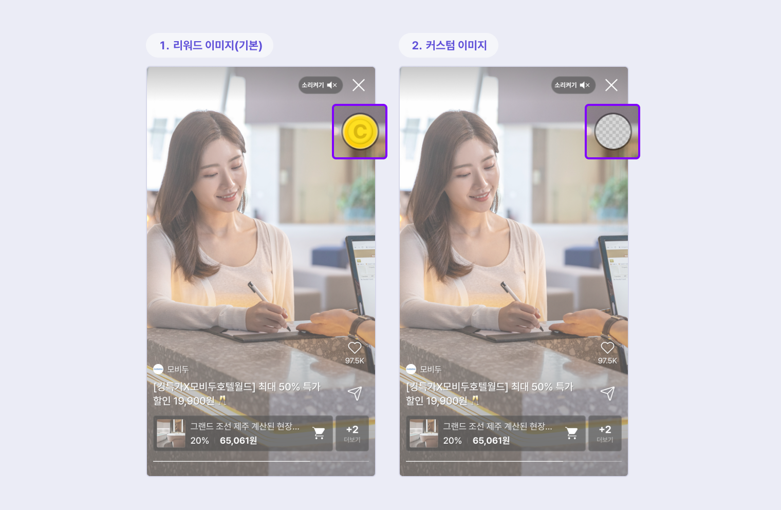
Guide to images used in reward progression and reward attainment
- Image size is recommended to be a square image of 150px * 150px.
- The file format can be SVG or PNG.
- Since the reward image is displayed to the player in the form of a circular icon, some of the square borders will be cut off.
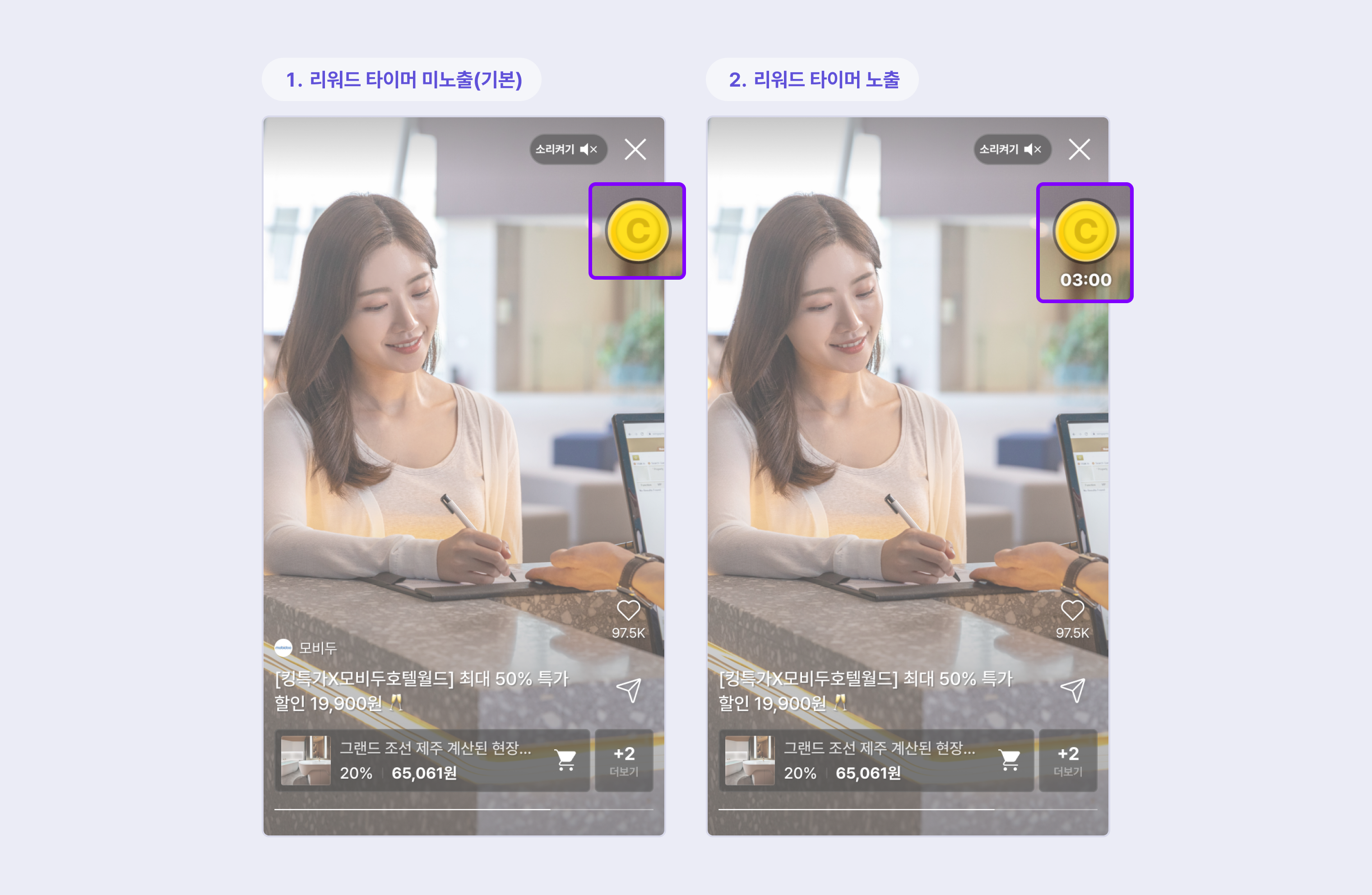
Reward timer (TBD)
Rewards are also available in Sauceclip. In this case, you can set whether to show the number of the timer that meets the reward criteria.
- Default : Do not show the number of the reward timer to the viewer.
- Custom : You can show the number of the reward timer to the viewer to let them know how much time is left to achieve the reward.
Sauceclip title rename
On the collection page, you can change the name of the category that aggregates your sauceclip content to a custom setting.
The default setting is Sauceclips.